
First, a little back story: I stumbled across a new book about what it takes to self-publish successfully, and with a catchy title like "Million Dollar Book Formula", of
So there I was, reading along, noting how their formula lines up with the 6 questions I ask you to think about in Before You Self-Publish, and then I got to the section on "packaging" and nearly choked.
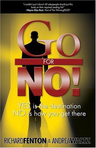
See, the authors point out that when they first self-published their (extremely successful) book, "Go For No", it didn't do well at all, and one helpful person finally told them that he had literally thrown the book they gave him in the trash before deciding to give it a second chance, because the cover was so bad he assumed what was behind it would be just as unprofessional and crappy.
So they set about finding a professional cover designer, got their new cover, and have been using it ever since - 12 years and counting. And the book has sold well.
Now, I don't disagree with the authors when they say that the purpose of the book cover is to sell the book, not to satisfy the artistic yearnings of the author - or the cover designer. And this OMG FUGLY cover isn't stopping them from selling the book. They're doing fine. But I'm going to go out on a limb here and say that at this point, that success is coming from the rest of their marketing efforts, not this (AWFUL) cover.
So much fugly packed into such a small space.
As I said, the authors are doing well. They've sold a lot of copies of this book. I'm standing by my "out on a limb" theory that those sales are happening in spite of the cover design. It's just nominally "professional" enough to beat out their original awful cover, and their other marketing efforts are what's powering their sales.
You don't have to go full FUGLY. You can keep a down-to-earth vibe in mind and still finish with a design that doesn't make puppies barf.
Here it is on the top-selling list in the category were it's doing the best - multi-level marketing. The authors have strong ties to that community, do a lot of speaking & networking, and that's likely where a lot of these sales are coming from. And like I suggested above, it's a market where people MIGHT be drawn to something that feels more accessible vs. high-end - something that makes them feel like, yeah, this person is normal like me, maybe I can do this too.
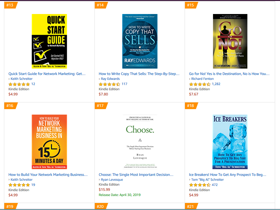
But there's STILL no other book with a cover nearly as fugly as this one on the rest of the list.
Now that we're here, it's hard to even know where to start. There's SO MUCH FUGLY. Let's talk about the colors first.
Now, reds and yellows show up a lot on book covers in this category, and there's nothing wrong with using them. Using them TOGETHER takes some skill, so you don't end up looking like ketchup and mustard. But here's a hint: Using a gradient, where the color gradually transitions from one to another, isn’t a solution. Whatever the question, gradients are almost never the answer. If you can't make your design work without a gradient, your design doesn't work.
The gradients happening here are the worst of the worst. Black/yellow is a hard gradient to get right. (Yellow + black tends to create weird shades of green.) Red/white is a hard gradient to get right. (You mostly end up with icky shades of pink or salmon that don't look like they’re what you meant to do. You lose a lot of the power that normally comes with the color red.) Stack one on top of the other and you've got OMG PLEASE STOP.
You may remember that we've talked about common typography mistakes here before. This cover packs in more than one of those mistakes. Effects - check. We've got drop shadows, we've got
I'm also going to assume there's a little bit of mistake #3, settling for what's in front of
I’ve talked about paying attention to phrasing when you're setting titles and subtitles, and that definitely applies here. The title is just really freaking awkward. Go is kind of big and loud, FOR is barely a whisper, almost an afterthought that's easy to miss. (There is ZERO reason to put FOR on a bar between “Go” and “No” like that. It's not doing anything for the meaning, and it looks goofy.) And then NO is big and bold again, which is good because that's where the attention belongs, but because of that exclamation point, Go is wider than NO, which makes the whole thing look weird and out of balance.
And that subtitle. The type itself isn't terrible, but the color is. White on yellow doesn’t suddenly become readable just because you put a drop shadow on it
(Here's a thought: dump the background image. It's cliched and boring, doesn't have
emotional impact, and doesn't look good. Why is it there? Why?)
The authors' names: yep, we've got an outline / outer glow thing going on, again, because of the difficulty of having type not disappear against that background. The type treatment used - no spacing between first and last name, setting the last name in bolder type - can look modern and attractive, but here it looks out of place because there's nothing it ties to. That concept isn’t used anywhere else. There's no repetition. No commonality between any of the elements on this cover. Hey, we've talked about that, too. (Coming up soon on the blog!)
I decided to keep the color scheme - yellow, red (well, an orangish red), black, white - but with a far more simple, clean, and modern design. I made NO! the focal point, because it really is the hook. It's more common to expect a sales book that teaches you to overcome objections and get people saying yes, so that NO! is the surprise that makes the book stand out.
The literal scene of the stereotypical "man in a suit" salesperson walking toward a doorway (presumably toward his oh-so-bright future) wasn't well done visually, but the idea of a path toward success is appealing. I wanted to suggest a similar feeling in a way that was much more abstract, bold, and impactful. I did that by using a white rectangle to suggest the feel of a doorway or an opening, with a red arrow leading into it, and that big "NO!" standing right at the edge. The wider perspective of the arrow at the bottom of the book makes it feel like a road the reader can walk on.
I experimented with different placements for the subtitle and the blurb quote, but keeping the blurb at the top and the subtitle below the title worked best, so I kept it. I've made both much easier to read than they were on the original. Putting the subtitle within the arrow further illustrates the concept in the book.
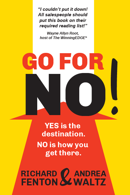
And, finally, I put the authors' names at the bottom in a layout that makes them important but not
Now, I don't actually know whether this style reflects the way these authors actually show up, or how their audience really feels about them. Those things are a critical part of the process when we're working together on your book. We’re always going for the strongest design to convey all of that in those first few seconds.
Throughout The Million Dollar Book Formula, the authors draw lessons from the way big brands sell their products (think Procter & Gamble) and apply them to self-publishing. And when it comes to packaging, the authors say that successful brands go out of their way to use "as little art as possible", and that the words "cover art" and even "graphic design" should be banned from the publishing industry, because your cover isn't a work of art, it's an ad for your book, and selling is more science than art.
I get what they're saying, I really do. Getting hung up on a romantic idea of what you want your book cover to look like is a mistake if it doesn't communicate & resonate with your potential readers. But here's the thing: the science of marketing is a soft science, all wrapped up in human desire and emotion. Trying to separate the science from art, from beauty, is missing half of the equation. Design is the process of wrapping the art and the science into an appealing whole.
Like Steve Jobs said: "Design is not just what it looks like and feels like. Design is how it works."
You need a design that works, that reaches your people, and you need to be able to trust your designer to create that even if it doesn't end up matching the idea you had in your head. AND, beauty matters, too. You’re not some freaking bottle of Tide on the grocery shelf. Without the art, the joy, the YOU, there's nothing to sell.
Design is science, AND art. Design is love.
