Case Study: How a comic strip uses repetition to make good design great

April 22, 2019

In case you missed it, we've been talking about repetition and how it's what actually gets a message across. I introduced you to the wonderfully weird comic strip, Robonk, created by my friend Brock Frazier, because I want to show you how subtle repeated elements can be while still being critical in the design process.

Case Study: Robonk, by Brock Frazier

Brock has been making design and process updates to the strip. We've chatted about font choices as he was looking for a new typeface for the humans in the strip. (I gave him one of my favorite tricks for type that looks warm and informal - it's all about the x-height, baby! But that's a topic for another time.) But I want to point out a couple of things about the choice he ended up going with, because it's a great example of enough repetition to tie everything together, while maintaining enough difference to clearly mark separate elements.

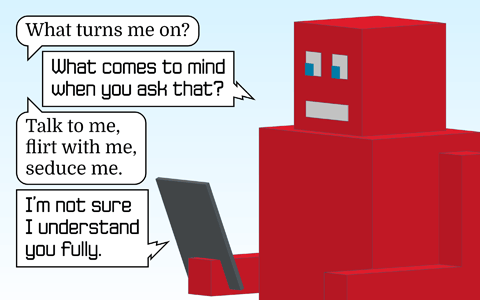
This is from one of the older style strips. The human font is clearly distinct from the robot font, and it works, but there isn't much design harmony.

A frame from the pre-upgrade Robonk strip. As always, we only see the robot in the frame. Speech bubbles show the conversation. The human: "I have always been a good girl." Robot: "When?" Human: "I am happy with the positive choices I have made, but feel as though I have missed out some."

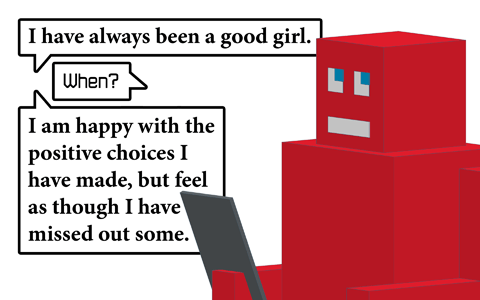
The recent visual upgrade shows how a number of small changes can add up to a huge impact. The differences between the robot & human dialogue are clear, yet subtle, creating a visual style that ties together and looks far more sophisticated and professional.

A more recent frame from the Robonk strip. As always, we only see the robot in the frame.  Speech bubbles show the conversation. The human: "What turns me on?" Robot: "What comes to mind when you ask that?" Human: "Talk to me, flirt with me, seduce me." Robot: "I'm not sure I understand you fully."

What repeated elements did you find?

Here are the ones I wanted to point out:

From the “old school” original:

  1. The robot being made up entirely of squares & rectangles. The boxy shapes repeat in the mouth and eyes. It's awesome because the blocky shapes match the clunkiness of the old school AI that generates the dialogue. Can't you almost hear that robotic voice?
  2. The speech bubbles echo those square and rectangle shapes.
  3. The robot's font has a squarish shape to it.

The upgraded version has way, way more repeated elements pulling it all together into a unified design:

  1. The background shade repeats the blue of the robot's eyes.
  2. The speech bubble outlines are a lighter weight now, which repeats the weight of the font choices.
  3. The human speech bubbles repeat the more rounded shape of the human's font, and the robot speech bubbles repeat the squares and straight lines of the robot's body, as well as the more squared-off lines in the robot's font.

Now let's talk about those fonts, because, let's face it: that's the part I really wanted to geek out on.

The robot's font has worked all along. It's got enough of a squared-off shape to give a mechanical feel, but the rounded corners and tall x-height* (I'm getting to that, I swear!) warm it up a little. This is a sex therapist robot, after all, not some emotionless stiff working a car assembly line.

The new human font is a great upgrade, and repetition is a big part of the reason for that. It's clearly distinct from the robot's, but they have a lot of elements in common that make the whole design feel much more harmonious and unified.

  1. The font weights are much more similar, vs. the bold of the human font in the original against the lighter weight of the robot's font.
  2. The x-height*. X-height is the height of the normal lower-case letters relative to the height of the upper-case ones. About half-way is pretty standard, and that's about where the x-height is in the original human font. But in the robot's font, and in the upgraded human font, the x-height is taller, and that tends to add a certain informal warmth.
  3. There are just a lot of subtle similarities in the letter shapes. Look at that letter "e"! That bottom curve...that slightly rounded bowl...that big opening...it's so subtle, yet they have so many more similarities in the new style.

So in the original, the human speech was bolder and colder than the robot's. Now, even though you can clearly tell they're different, the similarities (repeated elements!) make it feel much more like they're having the same conversation. Repeated elements between the font and the speech bubble (square vs. rounded) make it even more clear who's talking, while using the lighter line weight (repeating the weight of the font) creates harmony.

Repetition makes design work. And design that freaking works is what we're all about, yeah?

*There will be more about x-height, formality and space in a future geek-out. But that's probably plenty for today.

Sign up for a free Instagram grid template!

And stay on the list for design insights (some of 'em pretty snarky, #sorrynotsorry) from a 20+-year design pro who's completely in love with your online business. Plus, people on my list get first dibs on special offers, free templates & goodies.
* indicates required
linkedin facebook pinterest youtube rss twitter instagram facebook-blank rss-blank linkedin-blank pinterest youtube twitter instagram